

The key strategic challenge for Dems in 2020 — or indeed, any party or campaign, in any year — boils down to preference and turnout. How important is it to boost turnout of Dem-leaning voters, versus shifting the preference of likely voters toward Democratic candidates? And how does the answer change depending on whether you’re looking at national, state-wide, or local elections?
In our latest research post, now on GitHub, we continue our ongoing effort to dig into these questions by exploring turnout and preference data from the 2016 and 2018 elections, in order to make hypotheses about 2020. This installment builds on our prior analysis, in which explored VPV (votes per voter), which is the net “value” to the Dems of bringing a single new person in a particular demographic group to the polls on election day. (If that group splits 50/50 between Democrats and Republicans, then the VPV is zero. If the group leans 100% Democratic, then the VPV is +1.)
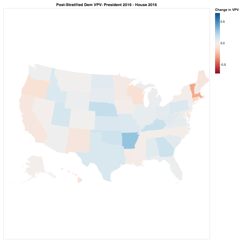
So, here’s one question we asked: How did voters’ party preferences differ in 2016 between the presidential election and House races? Or, put another way, in which states did Clinton over-deliver relative to the local Democratic House candidate? There’s a lot of detail by specific demographic group in our new GitHib post, but here’s a taste, looking at the state-by-state roll-up. (In the figure below, the bluer states are ones in which voters preferred Clinton more than their local Dem House candidates.)
Our analysis of these data (and more; see the GitHub post) led us to several preliminary conclusions — here are three of them:
In most of the presidential “battleground” states, non-college educated female voters under 45 broke more strongly for Dems in House races 2018 than 2016. Is there more nuance to the “working class voter” story than folks have previously thought?
On several measures, Wisconsin voters behaved much differently from those in Ohio and Pennsylvania. Are the “battleground” states more heterogeneous than we’ve previously appreciated?
There are interesting insights to be gleaned in Texas, which is evolving into a hugely important state (somewhat in 2020, certainly in the decade to come) — the overall blue shift hides some subsets that are actually moving rightward. What does this mean for the strategy in Texas in 2020 (for the presidency, House, and Senate) and beyond?
There’s more detail in the new post on GitHub — please check it out! And if you’re a fellow “data geek,” please check out our full Github page.
Want to read more from Blue Ripple? Visit our website, sign up for email updates, and follow us on Twitter and Facebook. Folks interested in our data and modeling efforts should also check out our Github page.