
As fundraising for 2022 elections gets into high gear, we are analyzing U.S. House and state legislature races to find the highest “bang for buck” opportunities for Democratic donors. In this post, we’ll explain our methodology and rationale so that you understand the basis for our recommendations.
TL;DR: By using our demographic model and historical results, we compare what happened in the past with what could plausibly happen in the future. That comparison helps us identify opportunities for Dems to flip historically red districts, and also places where Dems need more effort on defense than one might predict based on historical results.
In this post:
Brief overview of our election model
What we do with the output of our model
How we make recommendations for Democratic donors
Conclusions
Quick aside: This post focuses on explaining our methods to a lay audience. If you just want to jump to our state-specific recs, you can search for posts tagged “2022” in our blog by clicking here.
Brief overview of our election model
We’ve provided more detailed technical explanations of our model in several posts on GitHub (see e.g., here and here) — this is just a brief review for the less tech-savvy folks among us!
Our model describes each district based on intrinsic “demographic” factors like race, age, educational level, population density, etc. We then use prior turnout and voting preference data to estimate how various types of people in each state are likely to vote, and use these data to project the likely Democratic vote share in each district. So for example, if we determine that in a given state, white 30-40-year old college grads are likely to turn out at a 60% rate, and of those, vote 55% Democratic, and a given district is comprised of 12% white 30-40-year old college grads, we apply those turnout and preference numbers to that fraction of the district’s population — and then we repeat the process for every other demographic subgroup. The result is a projected “Blue Ripple Dem vote share” for each district.
What we do with the output of our model
Once we have our model’s projections, we want to compare them to historical results to identify places where they agree and disagree. In some cases, we and everyone else will recognize that a district is a tight toss-up, safely Democratic, or safe Republican. But we’re really interested in "mismatches” where a district’s demographics might make it a much bigger opportunity for Dems than you’d think based on prior results … or where Dems are more under threat than it might appear.
To do this, we compare our model’s results to what we call a “historical” model. We use a website called Dave’s Redistricting, which calculates what the Dem vote share actually was in each district based on precinct-level data. We then look at where the two approaches agree, and where they diverge.
How we make recommendations for Democratic donors
Once we have each precinct’s Dem vote share based on the “demographic” model (ours) and the “historical” model, we put them on a 2x2 matrix to see where they agree and disagree. For the historical model, we use -/+3 points around 50% as the range in which one would call a race essentially even based on past data. For our demographic model, we use a wider range (-/+5 points) around 50% to account for the statistical noise in our calculations.
The result ends up looking like this:
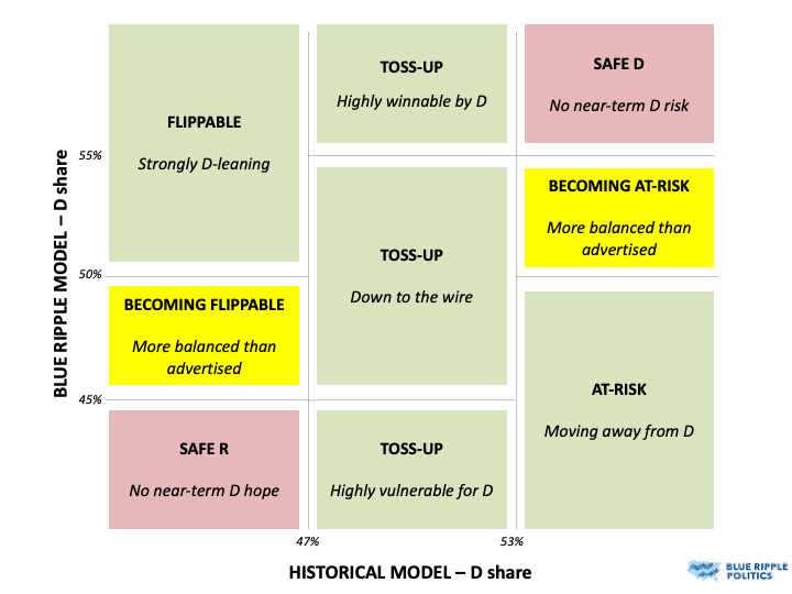
The upper right and lower left corners, colored in red, are places where our model and the historical model agree that a district is safely Democratic or safety Republican, respectively. We don’t recommend donating to these races; the “safe D” seats are very secure, and the “safe R” ones are such long shots that we don’t think it’s plausible to think we can flip them, at least in the foreseeable future.
There are wide swaths of the matrix, colored in green, that we think are the best opportunities for Dem donors to make a difference. These fall into three broad categories:
Toss-ups: Anything that looks like a “toss-up” in historical models (47-53% Dem) gets flagged as high-priority by us, regardless of the output of our Demographic model. The utility of our analysis in those cases is to give a realistic sense of how winnable those districts really are for Dems, but at the end of the day, we recommend you donate to all of them. In states with partisan redistricting, there are generally fewer U.S. House districts in this range than there were previously.
Flippable: In the upper left corner are districts have been historically Republican, but we think the demographics are strongly in favor of Team Blue. For example, GA-7 was a historically Republican district in the early 2010s, but the demographics had shifted strongly in favor of Democrats. This was clearly flippable in 2018, as evidenced by Carolyn Bourdeaux’s near-win that year. We think of these as the next wave of GA-7 districts.
At-risk: Finally, in the bottom right corner are vulnerable districts. These look dark blue from historical data, but we think the demographic winds are in the Republicans’ favor, so they’re much more under threat than most analysts think.
In yellow, we highlight two groups of districts we recommend for longer-term investment by Dem donors because they are “becoming flippable” or “becoming at-risk.” These are less likely to yield obvious returns in 2022, but we think dollars are important here to either move the needle toward flipping Republican districts or shore up support for Democrats who are becoming somewhat more vulnerable.
Finally, in red we note the “safe R” and “safe D” districts where we don’t recommend Dems make any donations. It may feel good to throw a few bucks to Marjorie Taylor-Greene’s Dem challenger, but based on how we see the current demographics, this is a poorer use of resources than other options.
Conclusions
With redistricting leading to fewer tightly contested districts, the main value of our analysis is in identifying mismatches between Dems’ historical performance and what we believe it could be in the future based on a district’s underlying demographics. These districts are likely to fly “under the radar” in analyses by Cook, Sabato, and others because they’ll appear strongly partisan based on historical outcomes — which means they are likely to see under-investment by Dems unless we pay attention to them. But they’re actually very important, which is why we strongly recommend them to Dem donors who want their dollars to have an outsized impact, both in 2022 and beyond.
Image via Pixabay.